Here I set your memory ablaze; may it burn until it glows...
Wednesday, September 27, 2006
Help me pick a card
Since I have been completely uninspired recently, and I am trying to pick a card for my blog, I thought I'd ask for your input, hoping that that would make my decision easier rather than more difficult (though I should know better...). I had asked my brother for a design, and got 6 instead (don't ask me what happened to No. 2; I never saw it!). Which do you prefer?
Ghassan, I guess I should have explained myself better. As I get invited to more readings, I am finding myself scribbling my name and my blog address for people on whatever piece of paper I can lay hands on after the reading. So I thought I'd be a bit more "professional" and have something like a business card with that info to hand out.
ya 3amme 7 is very clichet chou ossetkoun ya jame3a.
ashraf, during our meet in NY, zaha hadid will be featured at the guggenheim... are you interested or should I make my own plans. (Friday is "pay as much as you want" at the museum)
Thanks all for the feedback! As I expected, this is not making my decision any easier, but it's certainly fun!
Ziad, critique is part of the trade (for architecture as well as graphic design); so keep it coming! As for Hadid, I'm certainly interested; let's coordinate the details by e-mail. I'm typically not very much into these ego-exhibits at the Guggenheim (the Gehry one made me nauseous!), but Hadid is an exception. There aren't that many women or Iraqi starchitects, so I can certainly overlook the ego (and the bitchiness, which I hear is phenomenal!). Besides, she can design like the devil!
There is something horribly silly about talking about my own work (as it ought to speak for itself), but I would not consider it to be defending as much as an explanation of what I had in mind when I did 7. I want to thank you for your honesty by the way and, no, I was not offended at all.
I did 7 with the cliché as the very starting point of it actually. I wanted to go so deep into the cliché that I would break it; in a sense that I wanted to break the automatism of the critique of using a feather for a poet's card. What I was thinking of was really delving so deep into the feather that it loses its featherness and lightness, if you see what I mean.
The fact that the business card still read as cliché is interesting, though, because it shows me that the mission was not accomplished. I still think that zooming in more and more into the feather would start revealing its brutality.
I am so glad you wrote back. You see, I am not a politician, nor I have your brother’s talent of poetry, so often I do not mould and sculpt my words, and they come out really harsh and offensive; and I rarely mean it. This has always gotten me in trouble, so I end up not speaking my mind most of the time. I thought though that with Ashraf, since he is a fellow architect, I would be more at ease, and he would understand where I am coming from… I am glad you did too, and I really thank you for replying. This makes me more comfortable knowing that I did not offend the creator of this beautiful set of business cards.
I love the fact that you started out with the determination of breaking out from the cliché into something artistic and nice… And I know you are able to, because I like your other proposals. I wouldn’t go to the extent to say that you weren’t successful (as you state it – “mission not accomplished” ), as I was the only one who did not like #7.You can see from the comments, most of the contributors actually chose #7 as their favourite. So I am by no means THE reference.
Pretentiously, I could claim that I have a “trained” eye for critique and design, and therefore I would have loved to find something else to represent the poet (rather than a feather, ink or a notebook… you know… Hallmark stuff). If we wanted to go with that vocabulary, I may have like an abstraction of the feather or maybe your own interpretation of it… “Stylization”… Also zooming in furthermore towards a macro view where only the spine and the thin fibres are revealed might prove interesting also… an iconic representation of the feather… an index.
You are a good graphic designer Ahmad, and I really enjoyed our little exchange of ideas. Thank you, z.
Thanks for taking the time to share your opinions! I have been doing some additional polling amongst friends by e-mail as well, so here are the totals for everything (including my votes):
First place: (3) with 7 votes Second place: (7) with 6 votes Third place: (5) with 3 votes
So, I will be going with (3), which was one of my picks as well.
 1
1  3
3  4
4  5
5 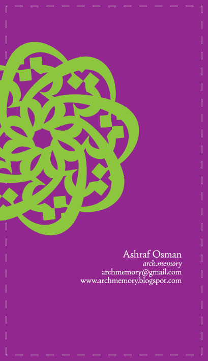 6
6  7
7
17 comments:
the 7th goes along better with your poetry theme but i like the third.
a card for your blog? I don't understand...
Mirvat, thanks for the input!
Ghassan, I guess I should have explained myself better. As I get invited to more readings, I am finding myself scribbling my name and my blog address for people on whatever piece of paper I can lay hands on after the reading. So I thought I'd be a bit more "professional" and have something like a business card with that info to hand out.
I'd say #6 , or if you prefer landscape, #7.
5 or 7 achraf
:)
that's a good idea by the way ashraf.
I am sure you're used to architecture crits, so I am going to presume that you won't be offended by my critique; nor would your brother I hope.
# 3 (i like it very much)
# 4 (not bad, can evolve into something very nice)
# 1 (a bit boring and pointless)
and I dislike the other options (5,6,7).
7 w bas wel be2i kelo khas... ;)
(bass kamen 7abet el 1 ... lol)
ya 3amme 7 is very clichet chou ossetkoun ya jame3a.
ashraf, during our meet in NY, zaha hadid will be featured at the guggenheim... are you interested or should I make my own plans. (Friday is "pay as much as you want" at the museum)
Thanks all for the feedback! As I expected, this is not making my decision any easier, but it's certainly fun!
Ziad, critique is part of the trade (for architecture as well as graphic design); so keep it coming! As for Hadid, I'm certainly interested; let's coordinate the details by e-mail. I'm typically not very much into these ego-exhibits at the Guggenheim (the Gehry one made me nauseous!), but Hadid is an exception. There aren't that many women or Iraqi starchitects, so I can certainly overlook the ego (and the bitchiness, which I hear is phenomenal!). Besides, she can design like the devil!
i like #3
number 3 and 7 (ma3 inno cliche :) )
Ops ghalatet ken azde ( 7abet 3 kamen mish 1) :(
_z ,, 7 ya3ni 7, ma bada tnen ye7ko fiha.. :P
eve,, sa7 w iza cliche.. mohem ne7na 7abayneh.. MOU.. lol
I'd say #7 and maybe #7, but #7 stands out, too.... :>)
To Ziad,
There is something horribly silly about talking about my own work (as it ought to speak for itself), but I would not consider it to be defending as much as an explanation of what I had in mind when I did 7. I want to thank you for your honesty by the way and, no, I was not offended at all.
I did 7 with the cliché as the very starting point of it actually. I wanted to go so deep into the cliché that I would break it; in a sense that I wanted to break the automatism of the critique of using a feather for a poet's card. What I was thinking of was really delving so deep into the feather that it loses its featherness and lightness, if you see what I mean.
The fact that the business card still read as cliché is interesting, though, because it shows me that the mission was not accomplished. I still think that zooming in more and more into the feather would start revealing its brutality.
Thank you for your feedback,
Son frère Ahmad
Ahmad,
I am so glad you wrote back. You see, I am not a politician, nor I have your brother’s talent of poetry, so often I do not mould and sculpt my words, and they come out really harsh and offensive; and I rarely mean it. This has always gotten me in trouble, so I end up not speaking my mind most of the time. I thought though that with Ashraf, since he is a fellow architect, I would be more at ease, and he would understand where I am coming from…
I am glad you did too, and I really thank you for replying. This makes me more comfortable knowing that I did not offend the creator of this beautiful set of business cards.
I love the fact that you started out with the determination of breaking out from the cliché into something artistic and nice… And I know you are able to, because I like your other proposals. I wouldn’t go to the extent to say that you weren’t successful (as you state it – “mission not accomplished” ), as I was the only one who did not like #7.You can see from the comments, most of the contributors actually chose #7 as their favourite.
So I am by no means THE reference.
Pretentiously, I could claim that I have a “trained” eye for critique and design, and therefore I would have loved to find something else to represent the poet (rather than a feather, ink or a notebook… you know… Hallmark stuff).
If we wanted to go with that vocabulary, I may have like an abstraction of the feather or maybe your own interpretation of it… “Stylization”… Also zooming in furthermore towards a macro view where only the spine and the thin fibres are revealed might prove interesting also… an iconic representation of the feather… an index.
You are a good graphic designer Ahmad, and I really enjoyed our little exchange of ideas.
Thank you,
z.
Thank you, and I still do not think that you appeared to be harsh! Were it not for your feedback, we would not have had our exchange of ideas.
Take care,
Son frère Ahmad
Hello all,
Thanks for taking the time to share your opinions! I have been doing some additional polling amongst friends by e-mail as well, so here are the totals for everything (including my votes):
First place: (3) with 7 votes
Second place: (7) with 6 votes
Third place: (5) with 3 votes
So, I will be going with (3), which was one of my picks as well.
Thanks again; this was fun!
Post a Comment